CSS
ps2ui-layout reads one stylesheet per screen and resolves it once, at build time. There is no runtime cascade, no media query and no user agent sheet. Every element starts from one frozen initial style and the sheet moves it from there.
What it is
A deliberate subset of CSS. The layout model is flexbox and border-box, so width and height include padding and border. Colours are flat. Geometry is baked into the blob, so anything that would need to be re-resolved on the console is refused rather than half-honoured.
Two rules have no CSS equivalent. flex-direction is required on any container that lays out two or more children. A :focus rule may not change geometry, because both focus states share one baked layout.
This screen is compiled from a sheet using rounded corners, a translucent fill over an opaque one, an ellipsized title and a :focus delta:
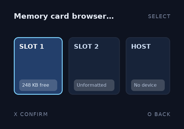
Its source is demo.html and demo.css.
Minimal example
A twelve-line sheet covering the flex axis, the box model, a border, a focus delta and an ellipsis:
.screen { flex-direction: column; padding: 32px; gap: 12px;
          background: #0e1320; color: #e8eef8; font-size: 18px }
.title { font-size: 26px; font-weight: bold; letter-spacing: 2px }
.list { flex-direction: column; gap: 8px; overflow: hidden }
.row { flex-direction: row; align-items: center; height: 48px;
       padding: 0 16px; border: 2px solid #222b40; border-radius: 8px;
       background: #182339 }
.row:focus { background: #24406b; border-color: #7fd4ff }
.row:focus .name { color: #ffffff }
.name { flex-grow: 1; white-space: nowrap; text-overflow: ellipsis }
.size { color: #7f8ca6; font-size: 16px }
.empty { opacity: 0.5 }
Compile it against a document with two focusable rows:
$ ps2ui-layout min.html min.css --fonts fonts/fonts.json -o min.json
ps2ui-layout: 15 paint commands, 2 focusables -> min.json
Fifteen commands for six elements, because .row:focus splits each row into an unfocused and a focused pair and overflow: hidden adds a scissor bracket.
Reference table
Every property below is a case in applyDeclaration. Anything else warns and is dropped.
Layout:
| property | values | default | notes |
|---|---|---|---|
display |
flex, none |
flex |
Any other value is an error. none drops the element and its whole subtree. |
flex-direction |
row, row-reverse, column, column-reverse |
none | Required. See the two hard rules. |
flex-wrap |
nowrap, wrap, wrap-reverse |
nowrap |
New in 0.7.0: wrap-reverse wraps and stacks its lines from the cross-end. In 0.6.0 it was accepted and behaved as nowrap. |
justify-content |
flex-start, flex-end, center, space-between, space-around |
flex-start |
Main axis. |
align-items |
flex-start, flex-end, center, stretch |
stretch |
Cross axis. stretch skips an <img>, see images. |
align-self |
auto, plus the align-items values |
auto |
Overrides the parent for one item. |
flex-grow |
number | 0 |
|
flex-shrink |
number | 1 |
|
flex-basis |
px, %, auto |
auto |
|
flex |
none, or <grow> [<shrink>] [<basis>] |
Shorthand. flex: 1 is grow 1, shrink 1, basis 0px. |
|
gap |
one or two px lengths | 0 |
Row gap first, column gap second. One value sets both. |
row-gap, column-gap |
px | 0 |
|
width, height |
px, %, auto |
auto |
Border-box: the value includes padding and border. |
min-width, min-height, max-width, max-height |
px, %, auto |
unset | Clamp the used size on that axis. |
overflow |
visible, hidden |
visible |
hidden brackets the children with a scissor pair. |
Box:
| property | values | default | notes |
|---|---|---|---|
padding |
1 to 4 px lengths | 0 |
Expands in CSS order: top, right, bottom, left. |
padding-top, padding-right, padding-bottom, padding-left |
px | 0 |
|
margin |
1 to 4 px lengths | 0 |
Margins do not collapse. |
margin-top, margin-right, margin-bottom, margin-left |
px | 0 |
Border:
| property | values | default | notes |
|---|---|---|---|
border |
<width> solid <color>, or none |
solid is the only style. A var() token is accepted here. |
|
border-width |
px | 0 |
Grows inward, border-box. |
border-color |
a colour, or var(--name) |
unset | A zero-width or transparent border emits no border. |
border-radius |
one px length | 0 |
One value only. Clamped to half the shorter side at emission. Costs 8 extra records per box; see what a rounded corner costs. |
Colour:
| property | values | default | notes |
|---|---|---|---|
background, background-color |
a colour, none, transparent, or var(--name) |
none | Flat colours only. A gradient is a texture to bake. |
color |
a colour, or var(--name) |
white |
Inherits. Carries its var() name to children. |
opacity |
0 to 1 |
1 |
Clamped. Multiplies into the alpha of this element's fill, border and text. |
var(), :root and @theme belong to theming.
Text:
| property | values | default | notes |
|---|---|---|---|
font-size |
px | 16 |
Inherits. |
font-weight |
normal, bold, or a number |
400 |
Inherits. 600 and above selects the bold face, see text and fonts. |
line-height |
px, a bare number, or % |
1.25 |
Inherits. A bare number multiplies the font size; % is divided by 100 first. |
letter-spacing |
px | 0 |
Inherits. Added between glyphs, after kerning. |
text-align |
left, center, right |
left |
Inherits. |
white-space |
normal, nowrap |
normal |
Inherits. nowrap suppresses wrapping; pre and friends are refused by name. |
text-overflow |
clip, ellipsis |
clip |
ellipsis needs white-space: nowrap, see text and fonts. |
Units
| unit | accepted by | notes |
|---|---|---|
px |
every length property | The only unit gap, padding, margin, border-width, border-radius, font-size and letter-spacing take. |
% |
width, height, min-*, max-*, flex-basis, line-height |
Resolved against the container's content box. On line-height it becomes a multiplier. |
auto |
width, height, min-*, max-*, flex-basis |
|
| bare number | flex-grow, flex-shrink, line-height, opacity, font-weight, and the size properties |
A bare number on a size is used as pixels. On a px-only property it is refused by name, except 0. |
em, rem, vw, vh, ch |
nothing | Not a length. The error names the token. |
Colours
| form | example | notes |
|---|---|---|
| named | black, white, red, green, blue, gray, grey, transparent |
The whole set. green is 0,128,0; gray and grey are both 128,128,128. |
#rgb |
#abc |
Each digit doubled. Alpha 255. |
#rgba |
#abcd |
Fourth digit is alpha. |
#rrggbb |
#aabbcc |
Alpha 255. |
#rrggbbaa |
#aabbccdd |
|
rgb() |
rgb(10, 20, 30), rgb(50%, 0%, 100%) |
Three channels, each a number or a percentage. |
rgba() |
rgba(255, 255, 255, 0.18) |
Alpha is 0 to 1 and scales to 0 to 255. |
Any other name is an error. orange does not compile.
Behaviour
Selectors and the cascade
The grammar is the type selector, .class, #id, * and a compound of those. Whitespace is the descendant combinator. :focus may sit on any compound, and a selector list is comma-separated. Nothing else parses. The child, sibling and attribute combinators are errors:
$ ps2ui-layout one.html child.css --fonts fonts/fonts.json -o x.json
error: css: line 1: unsupported selector syntax near ">" in ">"
A pseudo-class is answered by name, because there is one and the fix is never a different punctuation mark:
$ ps2ui-layout one.html hover.css --fonts fonts/fonts.json -o x.json
error: css: line 1: ".a:hover": :hover does not exist on this target. :focus is the only pseudo-class -- a pad-driven UI has no pointer, so there is no hover, active or visited state.
Specificity is the usual (id, class, type) triple summed over every compound, with source order as the tiebreak. * contributes nothing. :focus counts as a class, so .card:focus is (0, 2, 0) and beats div:focus at (0, 1, 1) whatever order they are written in.
Inheritance
Seven properties inherit: color, font-size, font-weight, line-height, text-align, white-space and letter-spacing. The var() name behind color inherits with it, so a theme moves a parent and its inheriting children together. Everything else resets to the initial value, background and border included.
The focus pass inherits from the parent's focus style. A focused row recolours the text inside it without the child carrying a :focus rule of its own.
The two hard rules
flex-direction is required on any container laying out two or more children. A container with one child or none is never asked, because the answer cannot change what is drawn. Every offender is reported at once, sorted by line:
$ ps2ui-layout undirected.html undirected.css --fonts fonts/fonts.json -o x.json
error: layout: 2 container(s) lay out two or more children without stating flex-direction:
  <div> line 1 (2 children)
  <div> line 3 (2 children)
There is no default. CSS's initial value is row, ps2ui once used column, so either silent answer is wrong for half of all authors — add flex-direction: row or column to each.
:focus is a paint-only delta. A :focus rule that sets any of 33 geometry properties is a compile error naming the property and the line:
$ ps2ui-layout f.html fgeo.css --fonts fonts/fonts.json -o x.json
error: css: line 2: :focus may not change "width" — focus is a paint-only delta. Both states share one baked layout; move the geometry to the base rule.
The guarded set is 33 properties:
| group | guarded properties |
|---|---|
| flex | display, flex-direction, flex-wrap, justify-content, align-items, align-self, flex-grow, flex-shrink, flex-basis |
| size | width, height, min-width, min-height, max-width, max-height |
| spacing | gap, row-gap, column-gap, padding and its four sides, margin and its four sides, border-width |
| text metrics | font-size, line-height, white-space |
| other | overflow, position |
A paint property passes:
$ ps2ui-layout f.html fweight.css --fonts fonts/fonts.json -o x.json
...
ps2ui-layout: 2 paint commands, 1 focusables -> x.json
Every focus state of the demo screen, drawn from one baked layout:
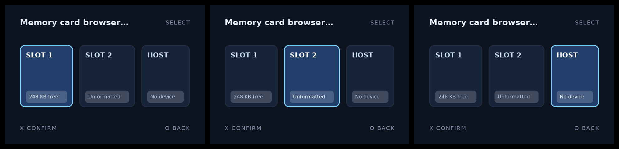
More on the focus graph is on focus and navigation.
Checked keywords
New in 0.7.0. Every keyword-valued property refuses a value it cannot honour. Eight are checked against the set the solver implements: flex-direction, flex-wrap, justify-content, align-items, align-self, text-align, white-space and text-overflow, alongside display, overflow and border, which already did.
The sets come from the solver rather than from CSS, and the difference is the point. justify-content: space-evenly, align-items: baseline, text-align: justify and white-space: pre are all real CSS with no branch behind them, so each is an error naming the layout it would otherwise have produced:
css: line 1: align-items: "baseline" is real CSS that this target does not
implement -- there is no baseline alignment across items -- text sits on its
own line box -- so it would have aligned to cross-start. align-items takes
flex-start, flex-end, center, stretch.
A misspelling reads differently, because it is a different problem:
Before this, all eight stored their value verbatim and every consumer ended in a default branch meaning "the initial value", so a typo produced a different layout at exit 0. flex-direction: rows laid out as a column and also satisfied the required-direction check, which asks whether a declaration exists and not whether its value parses. That was the one check over this family, defeated by the same typo.
Scissor and display none
overflow: hidden on a non-text box wraps its children in a scissor_push/scissor_pop pair, which becomes a GS scissor rectangle. There is no scrolling, so scroll and auto are errors.
display: none removes the element and its subtree before layout runs. The element occupies no space and emits no commands. On the root element it is layout: root element is display: none.
What a rounded corner costs
A square box is one record. A rounded one is nine (four corners, four edges and a centre), so border-radius adds 8 records to every box that carries it, flat, whatever the radius. That is the number ps2ui check budgets against and the one a data-heavy screen runs out of, so it is worth knowing before a list of forty rows is authored. Count it per box rather than per screen: text costs one record per glyph, so a row labelled Final Fantasy X is 13 of them before its background is drawn, and a whole-screen total says nothing about what the corners cost.
Two things do not scale with the box count. A radius that reaches half the shorter side is a pill: the middle row of cells has nowhere to go, those three are not emitted, and the cost falls to 5. And the corner mask is one texture per distinct radius, shared by every box that uses it and independent of colour: it is a (2r+3) square in PSMT8, 19x19 for 8px, charged 8 KiB of VRAM whatever the radius, because that is the smallest page allocation. Two radii in one blob cost two of them.
This is not an argument against rounded corners. It is the ordinary thing a console UI wants, and the price is knowable before it is paid.
Limits and errors
| message | cause |
|---|---|
css: line <n>: unsupported selector syntax near "<c>" in "<s>" |
A combinator outside the grammar, such as > or +. |
css: line <n>: "<s>": :<name> does not exist on this target. :focus is the only pseudo-class ... |
A pseudo-class other than :focus, such as :hover. |
css: line <n>: malformed declaration "<d>" |
A declaration with no colon. |
css: line <n>: selector without a block |
The sheet ends after a selector. |
css: line <n>: unterminated block |
A { with no matching }. |
css: line <n>: unterminated comment |
A /* with no matching */. |
css: line <n>: <p>: "<v>" is not a length |
A unit the parser does not know, such as em, or two values where one is expected. |
css: line <n>: <p>: unitless "<v>" — write "<v>px" |
A bare non-zero number on a px-only property. |
css: line <n>: <p>: only px supported, got "<v>" |
A % or auto on a px-only property. |
css: line <n>: <p>: bad color "<v>" |
A colour name outside the eight, or a malformed hex or rgb(). |
css: line <n>: padding: 1-4 values |
Five or more values in a box shorthand. Same for margin. |
css: line <n>: border: unsupported token "<t>" |
A border style other than solid or none. |
css: line <n>: display: only "flex" and "none" exist on this target (got "<v>") |
Any other display value. |
css: line <n>: overflow: only visible\|hidden |
Any other overflow value. |
css: line <n>: opacity: bad value |
An opacity that is not a number. |
css: line <n>: :focus may not change "<p>" |
A geometry property inside a :focus rule. |
layout: N container(s) lay out two or more children without stating flex-direction: |
One or more containers with two or more children and no flex-direction. |
layout: root element is display: none |
display: none matched the root element. |
css: line <n>: property "<p>" not supported on this target; ignored |
Warning. An unknown property, position included. |
css: line <n>: at-rule "<a>" ignored |
Warning. Any at-rule other than @theme. |
Every message above is listed with its stage and fix in diagnostics.
All three of those gaps closed in 0.7.0. letter-spacing, text-align and text-overflow inside a :focus rule are now compile errors of their own, separate from the geometry guard: they are read from the base style when the line is emitted, so a value there used to parse, apply and vanish. font-weight stays allowed, because bolding the focused row is the ordinary thing a console UI does, and the box is now measured at the heavier of the two weights so one baked layout holds both states; before, the weight was honoured when drawing and ignored when measuring, and a focused row drew past its box. On wrapping text that re-breaks the unfocused lines at the bold face's break points, and at some widths adds a line and makes the box taller in both states, so the compiler warns when the line count changes. And a :focus compound that matches no focusable element now warns instead of compiling to silence, which is what made it indistinguishable from a typo in the class name.
Related pages
| page | why |
|---|---|
| HTML | the elements and attributes a selector can match |
| Theming | :root, @theme, var() and the tint table |
| Text and fonts | measuring, kerning, wrapping and the ellipsis |
| Images | intrinsic sizing and the stretch deviation |
| Focus and navigation | focusable, the solver and reachability |
| CRT linter | contrast, overscan and minimum font size |
| ps2ui-layout | the flags that change the canvas and the lint floor |
| ui.json | what a resolved sheet becomes |